JDVision Mashup Contest: Kraków 2026

  • Brand Design
  • Motion Design
  • Social Media

#GETSEATED

  • University Project
  • Campaign
  • Motion Design

Welcome Home

  • University Project
  • Interaction

Making the Invisible, Visible

  • University Project
  • Motion Design

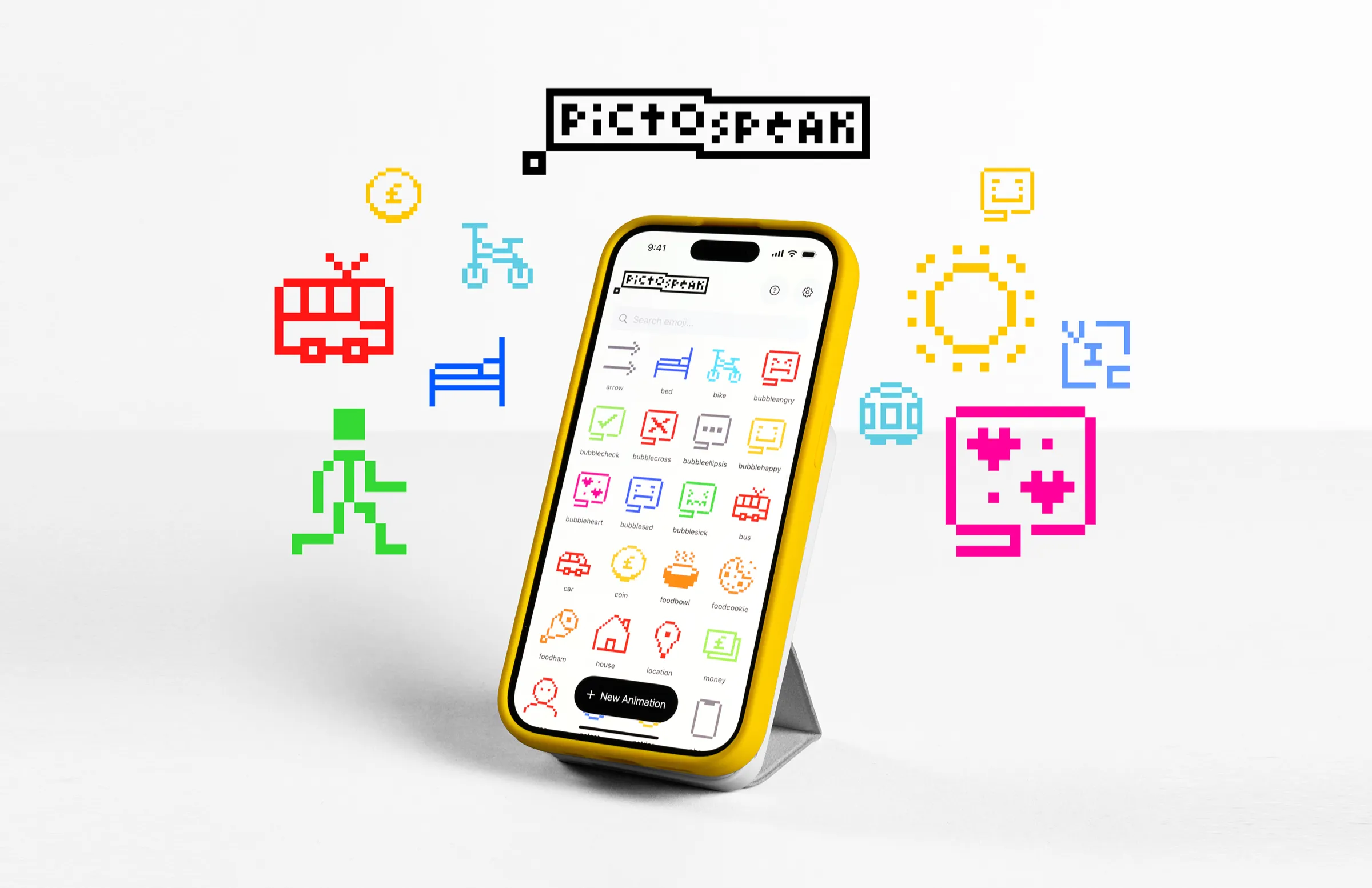
Pictospeak

  • App Design
  • Motion Design
  • Pixel Art

#GETSEATED

campaign identity & motion design

  • University Project
  • Campaign
  • Motion Design

For my Stage 1 Strategy & Identity Platform, I was tasked with augmenting an existing brand by creating a unique digital campaign.

With Sophie Chan and Dylan Pendlebury, I started imagining what SEAtS would be like if it were something students actually wanted to use, rather than just a tool for the University’s benefit. Our idea was a popup at welcome events: students would check in as if it were a lesson, in exchange for exclusive merch and goodies.

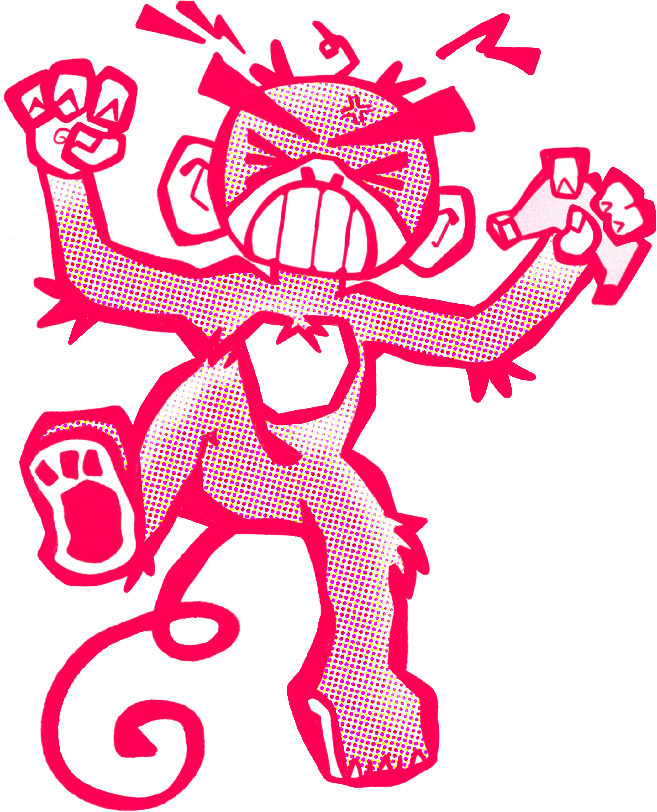
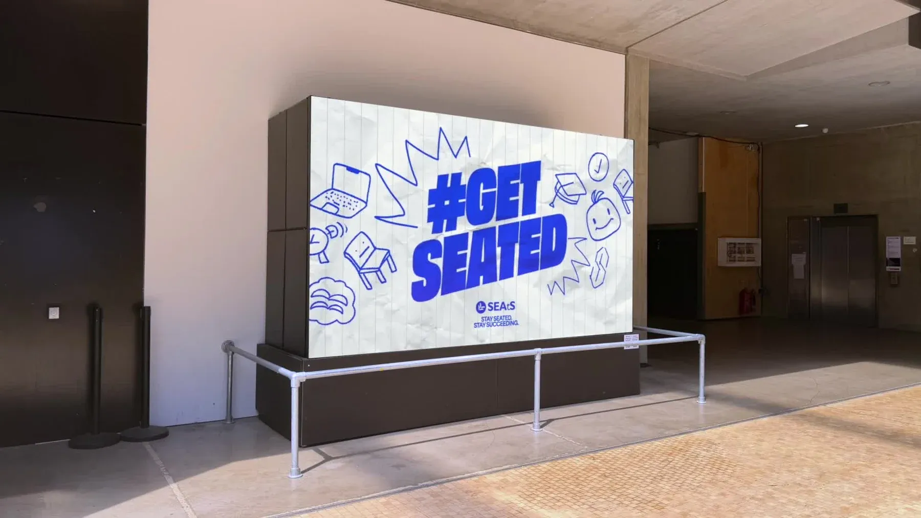
After getting a little stuck in ‘full rebrand’ territory, I proposed a quick visual mockup that turned into a complete, and extremely exciting pivot. We gave the campaign a name, #GETSEATED, and its own look: bright blue on white, paper texture and doodles scanned from my notebook. Sophie developed the mascot, stickers and check-in demo, while I created looping digital adverts and a phone animation in Apple Motion. We presented our Open Studio table as if it WERE the popup, giving all of this brand info a tangible context.

Watch the phone animation ↗ · Watch the digital screen animation ↗

Welcome Home

visual design & interactive installation

  • University Project
  • Interaction

For my Stage 1 Information & Systems Platform, I was tasked with exploring translation, taking an idea through different interpretations and mediums.

I wanted to portray the idea of Central Saint Martins being drained of its daunting mystery the closer I got to it. I took a photo of CSM and translated it in a few ways, presenting them as a set of posters under a theoretical “WELCOME HOME” campaign.

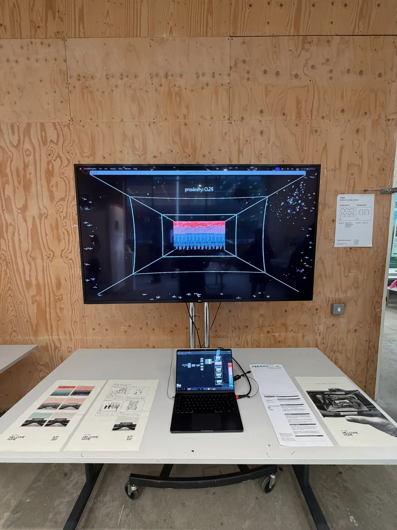
People responded most positively to the corrupted images, so I carried those forward into TouchDesigner. I interpreted the idea extremely literally: encouraging the viewer to physically move closer to a screen to ‘un-corrupt’ the image of CSM. Once you got close enough, “WELCOME HOME” appeared. Getting the interaction to make sense took a few goes. A change in scale, perspective lines and tape on the floor made so much difference.

Watch the installation reel ↗

Making the Invisible, Visible

illustration, animation & sound

  • University Project
  • Motion Design

For my Stage 1 Narrative & Voice Platform, I was tasked with making invisible sciences visible, drawing on Marie Neurath’s work with Isotype to communicate them in an engaging way.

I wanted to realise Marie Neurath’s goal of scientific communication in a modern context, and what is more modern than social media? Tuned for online attention spans, I imagined a short, looping animation that communicated various sciences in a compact and memorable manner.

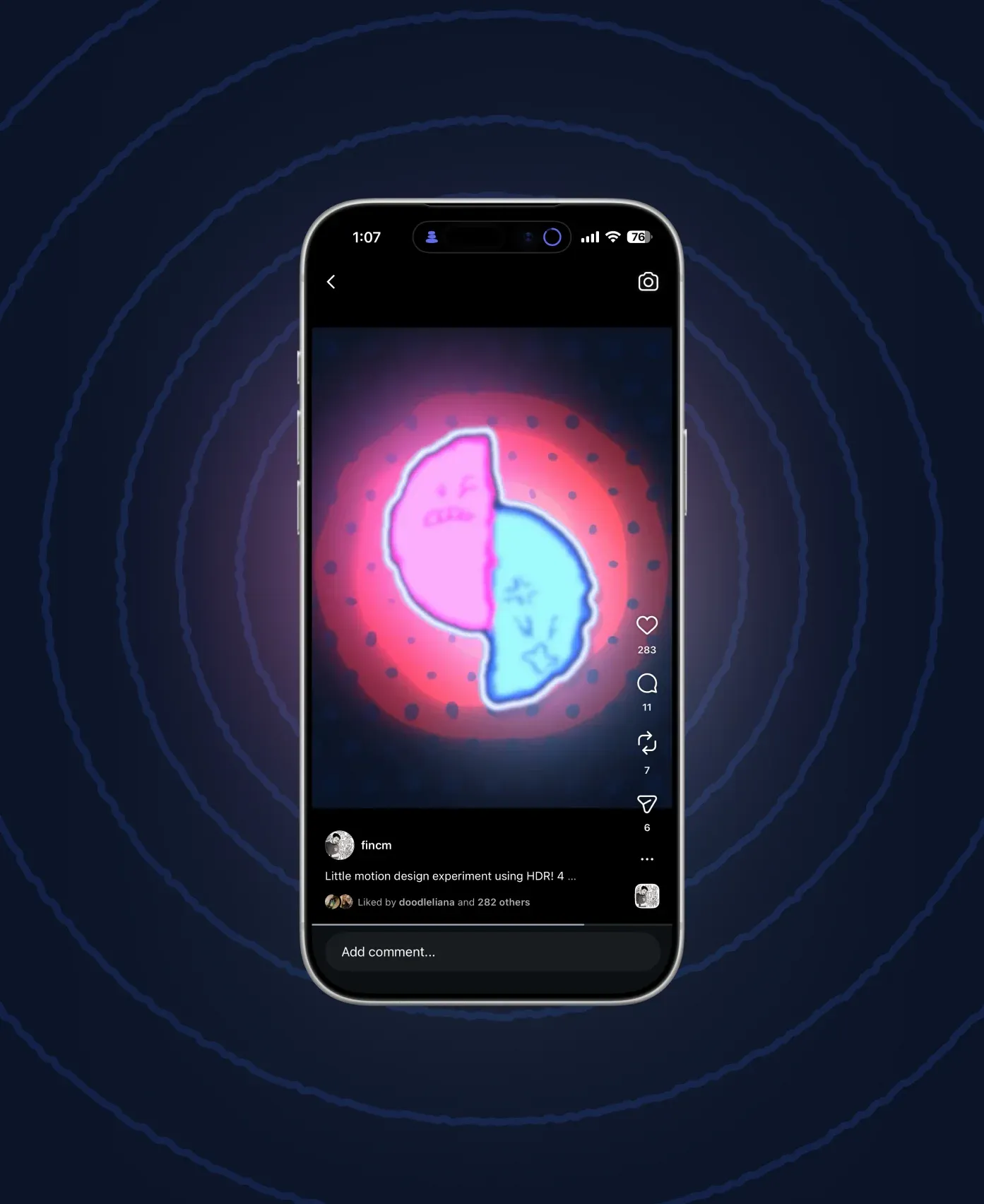
I drew two characters to represent the opposite poles of a magnet, working their polarity into their faces, then animated them in Apple Motion. Their movements communicate magnetism and friction, while the background dots ripple, shake and melt to represent sound and heat. I also added a comedic element in the form of my own high-pitched grunting, giving the two halves a more obvious character as they tried to resist the magnetic pull between them.

Magnetism, friction, sound and heat.

Watch the animation ↗